
WEBSITE REDESIGN
The UX redesign that made TSH WoodLab's only storefront 20% more engaging & 1.5X more efficient
Client
TSH WoodLab is a Toronto-based woodworking studio serving residential clients and interior decorators with custom, high-quality bespoke furniture and decor.
Overview
As the studio’s sole storefront, TSH WoodLab’s website struggled to showcase its full range of offerings, from custom furniture to design consultations, limiting its online reach and effectiveness. The fragmented portfolio experience and lack of process visibility obstructed TSH’s goal of becoming a go-to destination for customers seeking unique, high-quality woodwork and streamlined service.
My role
Entire UX/UI design from research to conception, visualization and testing in collaboration with a developer.
Project Specs
Furniture and Home decor , e-commerce, B2C
2024, 4 months timeline
Choosing bespoke furniture can feel overwhelming, leading many to abandon it or opt for mass-market alternatives. A clear, intuitive website with customization options and transparent pricing makes the process simple and accessible.
To tackle these challenges, I brainstormed what makes successful woodworking studios stand out.


“I spent way too much time scrolling just to figure out how much this would cost me.”
Without upfront clarity on the value and pricing, users struggled to determine if TSH’s offerings aligned with their budget.
" Where can I browse to see all furniture options — Shop or Gallery ? And are most of the inventory in the Shop sold out?"
Users found it challenging to decide where to browse—Shop or Gallery—due to unclear navigation and an overwhelming number of sold-out items in the Shop. Lack of essential information further made it difficult to fully explore available furniture options.
"Can I change the finish on this piece? What’s customizable here? How can I show what I want?"
Users were curious about how custom pieces were created and wanted a step-by-step overview. Many users had questions about the materials, finishes, and design options but found no easy answers.
Additionally, an important insight quietly emerged:
TSH’s work is defined by creativity, precision, and exceptional craftsmanship. The website needed to reflect this same level of professionalism while inspiring potential clients to connect with the brand. However, the site failed to showcase the studio’s unique craftsmanship, coming across more like a generic retail site. This disconnection left visitors feeling disconnected from the studio’s true character, causing confusion about its value. As a result, engagement declined, brand perception weakened, and conversion rates dropped.
Uncovering the Customer’s Path
Building on the data, I was able to track how customers were navigating the process. This insight revealed gaps, unnecessary steps, and areas where the user experience could be streamlined, offering a clearer path to enhance the overall journey.
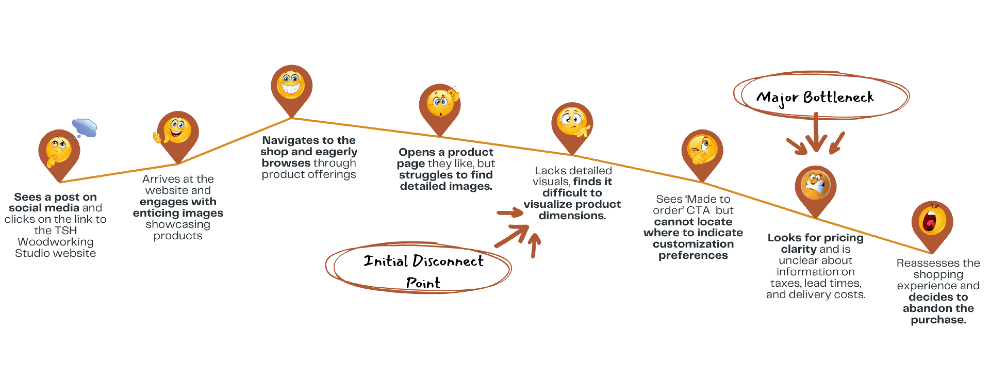
Current User Journey
This inspired me to create an ideal user flow, envisioning how the redesigned website should feel. It evolved into an experience map that traced the user’s journey and emotions at each step, revealing opportunities to make the studio more discoverable and enjoyable to engage with.
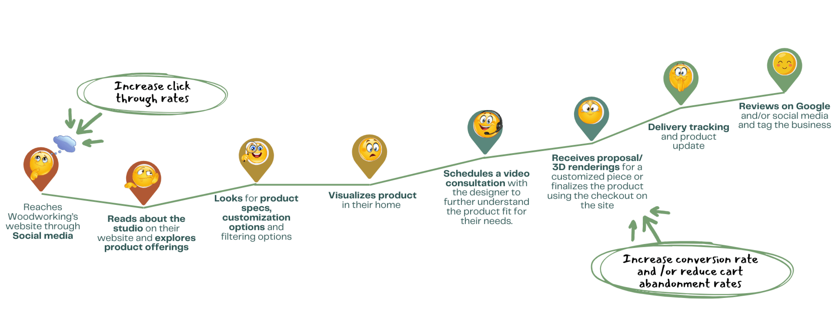
Ideal Customer User Journey
Achieving Balance: Aligning User Needs with Business Goals to Create an Effective MVP
As I delved into the customer journey, the project scope expanded beyond initial expectations.
To maintain focus, I interviewed the studio’s business owner and set clear goals that balanced user needs with business objectives. This allowed me to prioritize key features for the MVP, ensuring the redesign aligned with the studio’s KPIs and long-term vision, and ultimately delivering the highest value.
15%
increase by 15% within 2 months of launching MVP
10%
decrease bounce rate by 10%
20%
Increase by 20% within 2 months of redesign
15%
increase by 15% within 2 months of launching MVP
15%
increase at a consistent rate of 15% per month
$5000
generate a min of $5000 consistent monthly revenue within 6 months of redesign
Designing with Purpose: Prioritizing Features for Optimal Impact

Feature Priortization Matrix
product visualization
improve product pages
highlight materials, colour and texture via detailed imagery.
immersive visual experience through videos/ 3D renderings
museum like portfolio viewing
ux content writing and feature integrations
clarity in pricing & customization costs.
customization process
showcase customization process for better user guidance.
display star ratings, reviews, and product availability
customization options and provide easy contact forms.
Filters options for materials, home decor.
I then sketched a paper prototype, focusing on the homepage layout and structure. I integrated key improvements based on insights from user interviews and usability data.
The landing page was thoughtfully crafted to ensure a seamless user experience, guiding visitors to key sections like product collections, client testimonials, recent projects, and the studio’s unique selling points.
Each element was carefully positioned to provide a clear, engaging overview of the studio’s craftsmanship, building trust and encouraging deeper exploration.

Bridging Social Media to Mobile: A User-Friendly Responsive Design

User Flow
Combine the Gallery and Shop into one product page. Make it easier to browse, purchase, or customize items with key details and process information displayed upfront in a simple, user-friendly layout.
" Where can I browse to see all furniture options — Shop or Gallery ? And are most of the inventory in the Shop sold out?"
Solution 1 : Unified product page for seamless browsing and customization
✅ Simplifying the design to allow users to seamlessly transition between viewing images, making purchases, and request to customize a previously built project for their space..
✅ This update organizes the information in a clear, straightforward layout, without the need to navigate through multiple sections.
✅ Gives the business owner a chance to showcase their portfolio without the ‘sold-out’ tags discouraging users from exploring the products.


“I spent way too much time scrolling just to figure out how much this would cost me.”
Solution 2 : Improved Product Card Layout for Quick Exploration
✅ The product card layout was redesigned to display key details at a glance, such as the item name, price, dimensions, and customization options, without needing to open individual product pages.
✅ For those interested in further details, they can easily navigate to the product’s dedicated detail page to explore additional information and customization possibilities.


"Can I change the finish on this piece? What’s customizable here and what is the process? How can I show what I want?"
Solution 3 : Transparent Customization Process with Detailed Material Information
✅ Added a dedicated page to showcase the entire customization process, providing a clear, step-by-step overview and detailed information on each stage to ensure transparency and clarity for users.
✅ Highlighted the high-quality materials used in the customization and enhanced the user experience by providing all necessary information and tools in one convenient location.
✅ Integrated a calendar feature for easy scheduling of consultations.


Turning Feedback into Action: Elevating the User Experience with Usability Insights
I conducted 5 usability tests on the first prototype, each involving 2 tasks and a questionnaire tailored to evaluate the site’s effectiveness.
Feedback was gathered across four key areas:
ease of finding product information
clarity of pricing
ease of scheduling consultations
overall engagement with the brand’s offerings.
🧪 Testing with several clients revealed that, while the new layout clarified the purpose of each section and included all necessary information, it still overlooked some critical needs.
💡SOLUTION:
To address this, I researched popular furniture e-commerce platforms to understand how they efficiently display pricing and customization options. This gave me insights into simplifying the user journey while still providing all essential details.
✅ Displaying product cards upfront on the products page, with key information like customization options and pricing, allows customers to quickly assess if offerings fit their budget.
This streamlined layout reduces the need for extra clicks, letting users access essential details at a glance—like pricing and customization—without navigating to individual product pages.


🧐 USABILITY INSIGHT #2 :
🧪 Users showed difficulty in quickly locating product prices on the product detail pages, leading to uncertainty around essential product details and often resulting in abandonment. It became evident that, for many users, seeing the price upfront is crucial in deciding whether they want to explore a product further.
💰 For small businesses especially, transparency in pricing is key to building trust and encouraging further engagement.
💡 SOLUTION:
💵 Prominently display pricing: Ensure the product price is immediately visible on the product description page to reduce uncertainty and encourage users to explore further.
⚠️ Add a transparent pricing disclaimer: Include a simple note about any potential additional fees to build trust and eliminate hidden surprises.
•👀 Refine text treatment: Use styling and text color to draw attention naturally to the product price, making it easy for users to locate key information at a glance.


🧐 USABILITY INSIGHT #3:
"The pieces look beautiful, but I have so many questions—not just about the materials, but also about customization options like sheen and other possible adjustments"
Testing revealed that users often struggled to find answers easily and requested a more organized approach to accessing answers to frequent questions.
💡 SOLUTION :
To enhance clarity and improve the user experience, we could implement two separate FAQ sections—
one dedicated to general questions about materials and
another focused on product-specific inquiries.
By placing both sections in a single location with a simple toggle button to switch between them, customers can quickly find the information they need, leading to a more streamlined and enjoyable shopping experience.


Exploring Future Possibilities: AR, AI, and a More Seamless Shopping Experience
Key Insights and Final Reflections
Working on the website’s user experience was a rewarding adventure that sparked cross-pollination between my UX work and my role as an interior designer at TSH Woodlab.
As I tackled the project, I uncovered fresh insights that reshaped my design approach in both realms.
transparency is key
The location and visual treatment of essential details were crucial for building user trust. Clear and accessible information is vital for ensuring users feel secure and informed.
brand makeover matters
I recognized that the original design didn’t align with our brand vision, prompting a complete overhaul. Investing extra time to enhance the layout and user flow helped create a cohesive and engaging experience that resonated with our audience.
taming scope creep
