
Project Overview.
Client
Four Realms of Chaos is a premium tabletop gaming studio specializing in miniature painting, sculpting, and assembly. The studio brings fantasy worlds to life through meticulously crafted models and has built a dedicated community of gamers and collectors over 10 years.
Overview
In late 2024, the owner of a local miniature painting studio reached out with a problem, He was frustrated, his website was supposed to help customers commission custom-painted miniatures, yet his inbox was flooded with incomplete or empty form submissions. Instead of clear project details, he received vague inquiries, forcing long, drawn-out email exchanges that delayed onboarding and, in some cases, led to lost business.
" If people aren't filling out the form properly, how can I even start their projects on time?"
But that wasn't his only concern. For years, he had been selling paints, brushes, and trading cards through word-of-mouth and in-person sales. While his community of collectors was loyal, his reach was limited. He wanted to expand, offering an online store where customers could easily purchase gaming supplies, something he knew he could use to increase studio's revenue.
My role
Entire web design from research to development, testing and brand alignment.
Project Specs
End - to- end website redesign
Games and Hobbies, e-commerce
2024-25, 4 months timeline
Outcomes of the Redesign.
Problem.
The Four Realms of Chaos website was creating frustration for both the business and its customers:
🚫 The contact form submissions were returned incomplete or empty, making it impossible to start projects without multiple follow-ups.
🚫 Customers did not have clarity in understanding pricing and services, causing confusion and delays.
🚫 Key information about services and pricing was buried, leading to potential customers abandoning inquiries and key information was buried in a data wall.
🚫 The business was looking for expanding their services beyond offline channels.
The Research Journey : Finding The Right UX Research Methods.
Redesigning the studio's website wasn't just about fixing the usability issues but also proving its business impact. So asking the right questions and employing the right UX research methods was quintessential.

I started with this simple question.
To find out, I first needed to talk directly to users and understand their frustrations. And following were the insights:
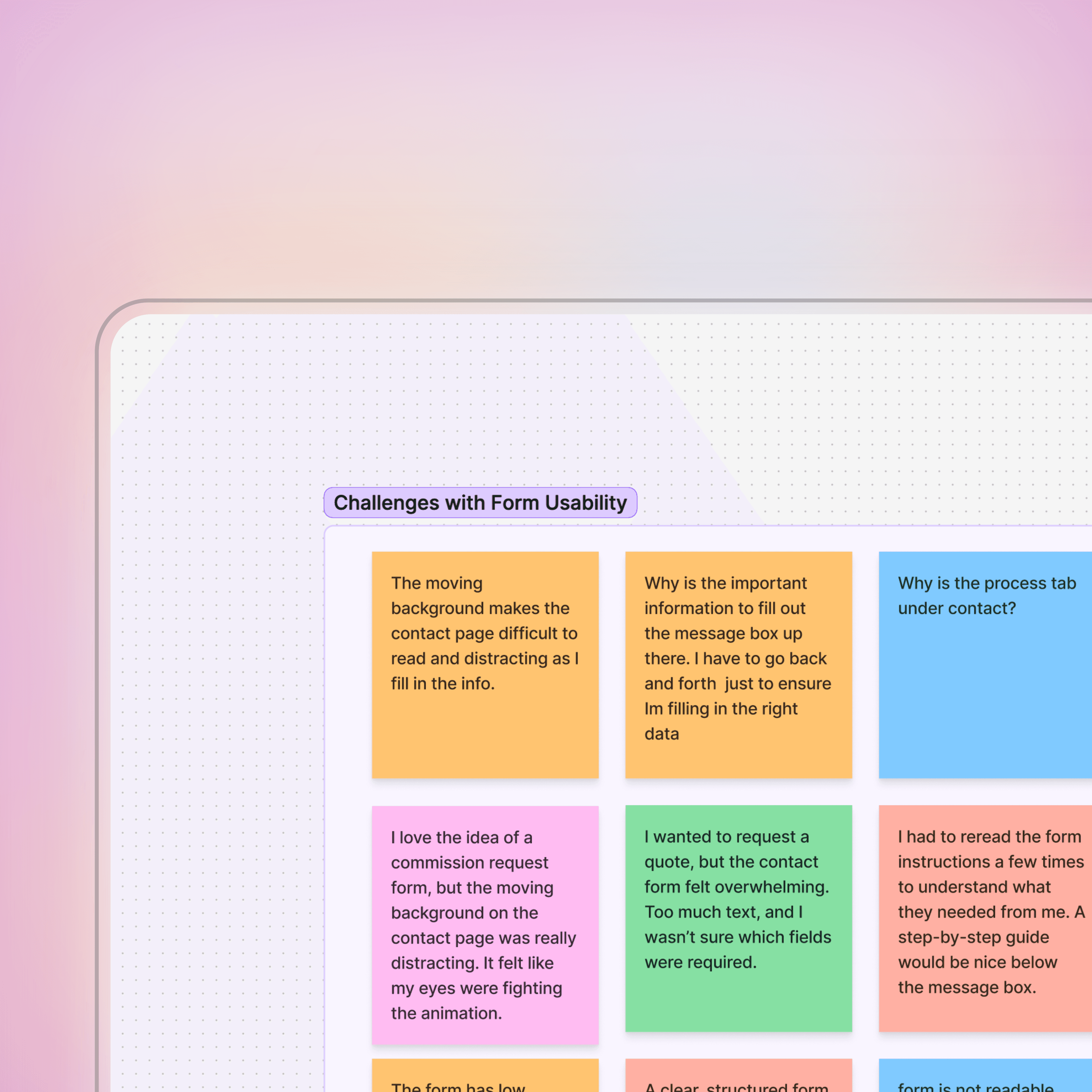
User interviews and usability data:

what details to send
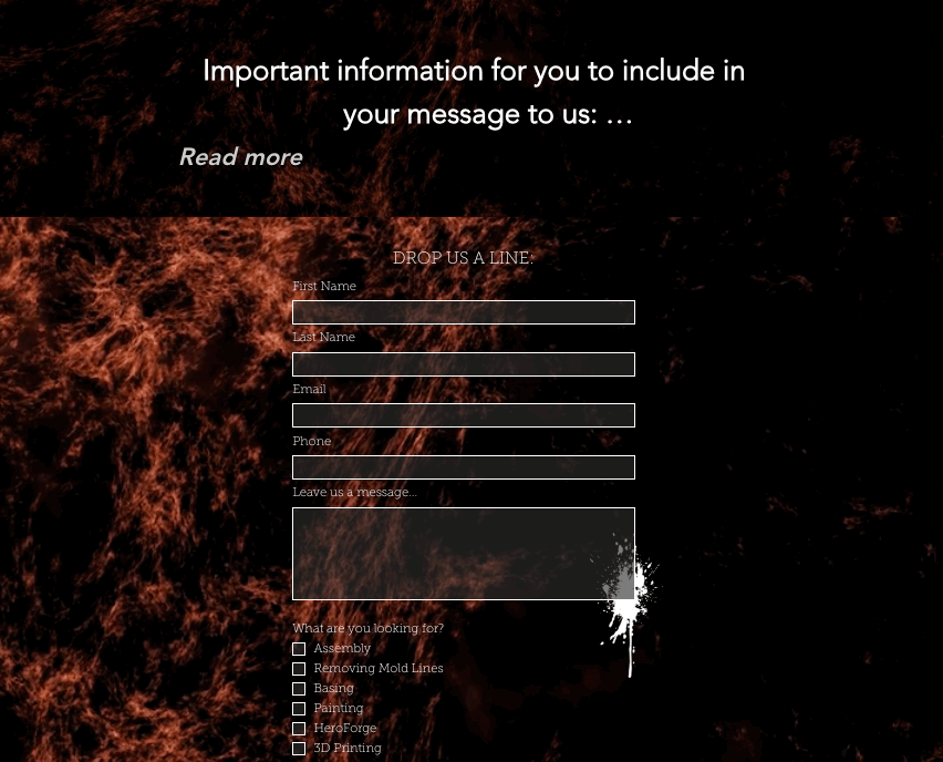
Users weren't sure what details were required and had to navigate back and forth between the important information section ( placed at the top) and the message placeholder to make sure they included everything needed.
readability & accessibility issues
Poor contrast between text and background made content difficult to read.
A moving background further created motion sensitivity issues, making it even harder to focus on reading important data or performing key actions.


long walls of text
The important information felt overwhelming with too much text, so users abandoned the submissions altogether.
Additionally lack of " required field" checks led to return of empty forms.
process tab hidden under contact
While users could technically find the commission process details, the weren't seeing them at the right moment. Something about the way the information was structured was making it harder.


To back up my findings, I needed to dig deeper into how the users expected information to be structured and I knew that card sorting would be the key.
I ran a card sorting exercise and was able to confirm a major issue:

insights from card sort
Participants grouped process on its separate page or under services section. It was clear process should be visible before reaching the contact page not buried inside it.
Some participants added a new card called portfolio and believed the posts from social media feeds and previously done projects should be added to it.

However, navigation wasn't the only issue. Before, making any design changes, I needed to identify the deeper usability flaws - so I conducted a heuristic evaluation, assessing the site against key UX principles.
I discovered several critical issues:

inconsistent button styles
Button styles across pages made interactions unpredictable. Some buttons looked clickable but weren't, while others lacked hover states or clear affordances.
No standardized font weights led to a lack of visual hierarchy, making it hard for users to distinguish between heading subheadings and body text.
broken contact forms
No required field validation meant users didn't get warnings about missing fields hence submitting empty or incomplete forms.
poor information architecture
No clear CTA's on key pages, leaving users at a dead end rather than guiding them towards next step

Research alone wasn't enough, I needed the hard data to quantify the problem, leading me to track analytics.
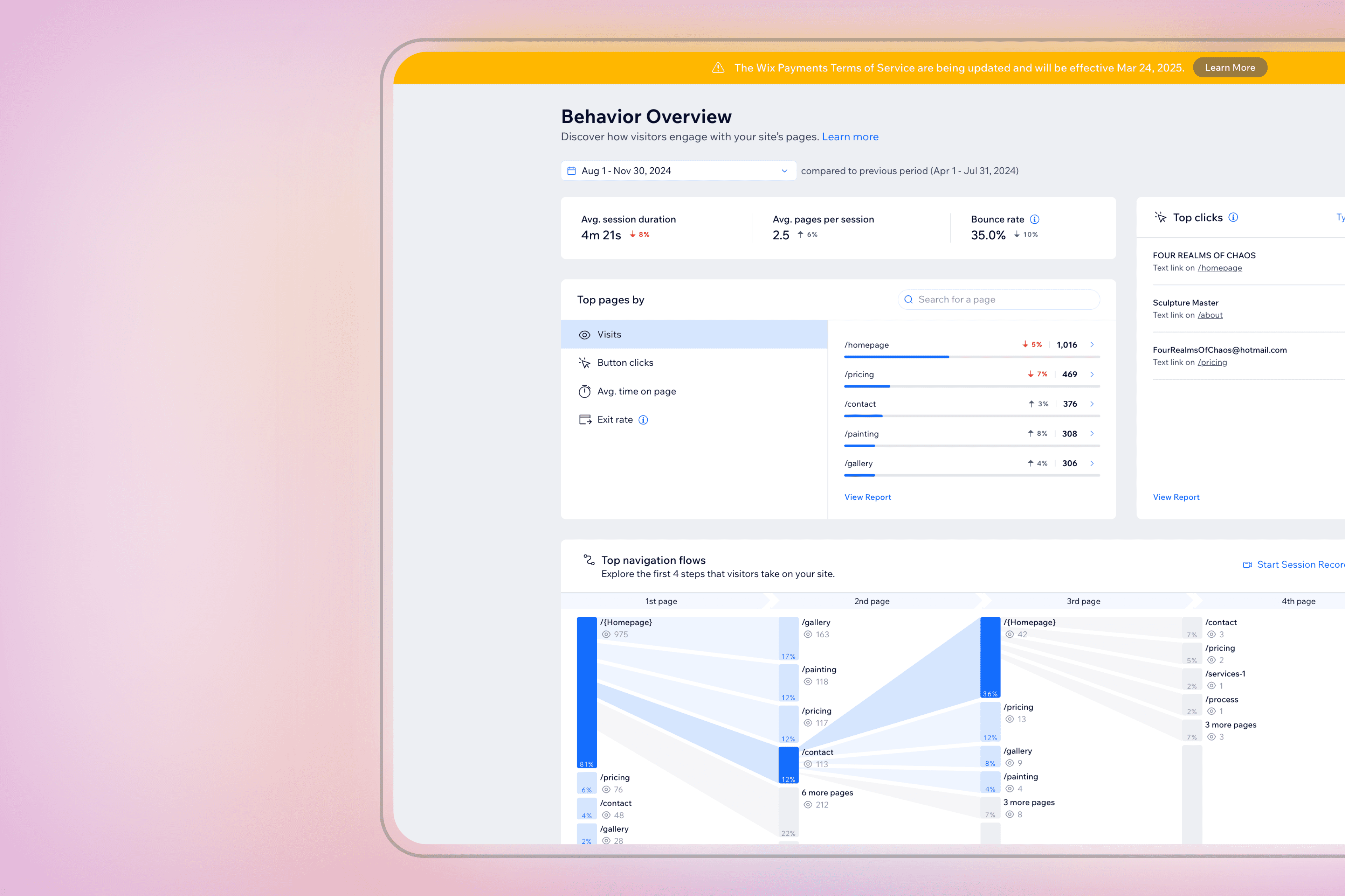
insights from analytics
Many users were abandoning the site on pricing related or painting service page.
A significant number never reached the contact form at all.

And finally, before making design changes, I needed to see how industry leaders structured their websites to present the commission information, pricing and e-commerce store effectively. This helped me understand:
✅ How top performing studios structured their commission process?
✅ How pricing and service levels were presented to reduce user hesitation?
✅ What industry best practices I could apply without sacrificing the unique identity of Four Realms of Choas.
Stakeholder Buy-in For UX Improvements.
Convincing stakeholders to embrace UX improvements wasn't easy, especially when design choices felt personal.
What was happening?
The business owner initially resisted certain design changes, such as removing the moving background, altering button styles, and improving contrast. They believed these elements added personality to the site and were hesitant to change them. They also did not see an issue with the readability or contrast.
What did I do to resolve it?
presented user research findings
I showed evidence from usability tests, interviews, and user frustration points to illustrate the need for change.
It helped me demonstrated how these design choices were negatively impacting user experience.

I highlighted key stats such as high bounce rates, low form completion rates, and other hard data from analytics.
This helped business owner to see the flaws from a business perspective. It wasn't just about aesthetics , the current design was actively hurting conversions.

competitor benchmarking
I compared the studio's website with successful competitors to showcase how industry leaders were designing for usability.
When I presented this final research step, the business owner was now fully onboard with a complete UX redesign.
What did it lead to?
The final design choices were backed by data, ensuring they met both user needs and business goals.
I showed evidence from usability tests, interviews, and analytics that demonstrated how these design choices were negatively impacting user experience.
With buy-in secured early, implementation was more streamlined, avoiding back-and-forth revisions.
Building the design: Solutions and Outcomes.
I then sketched paper prototypes, focusing on the homepage layout and structure. I integrated key improvements based on insights from user interviews and usability data and set out to build the design for the website

Challenge 1:
Clients were submitting incomplete contact forms, leading to endless email exchanges that delayed project onboarding.
Solution:
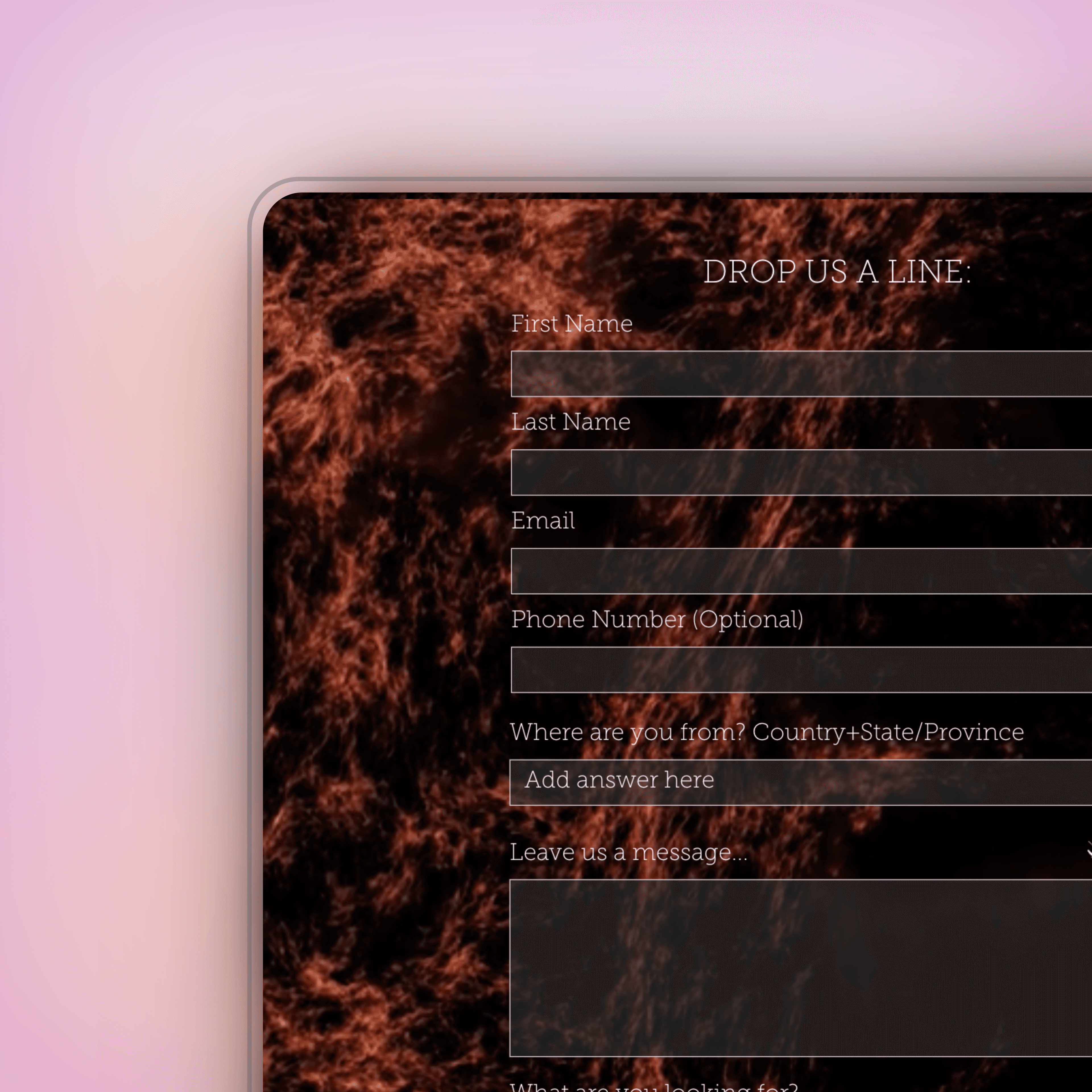
improving form usability
✅ Introduced required fields to ensure complete submissions.
✅ Added Google Drive upload field for inspiration images, enabling users to visually convey ideas.
✅ Structured the form logically to guide users through each required detail.
✅ Placed an alert button closer to the message placeholder field to draw user attention to important instructions before submission.
✅ Changed the background to improve contrast, making the form easier to read and interact with.
✅ Left- aligned the form, improving readability and overall visual hierarchy.
Outcome :
30%
increase in enquiries
more enquiries with comprehensive project details
0%
incomplete form returned
ensuring all necessary info is collected upfront
40%
faster project onboarding
reduced back and forth emails, accelerating project start times
Challenge 2:
Information about pricing and painting levels was scattered across the site. Users had trouble distinguishing between painting levels and often felt lost when trying to compare services.
Solution:
better comparison chart
Designed side-by-side comparison chart for painting levels, making it easy to differentiate between the options.
better structured information
I replaced unstructured text with product cards, presenting pricing and features in a visually digestible format.
improved pricing page
✅ Improved pricing tables UI, by redesigning them with a sleek, dark futuristic aesthetic, ensuring brand consistency.
✅ General payment information restructured from a wall of text to cards in an easy to read and scan format

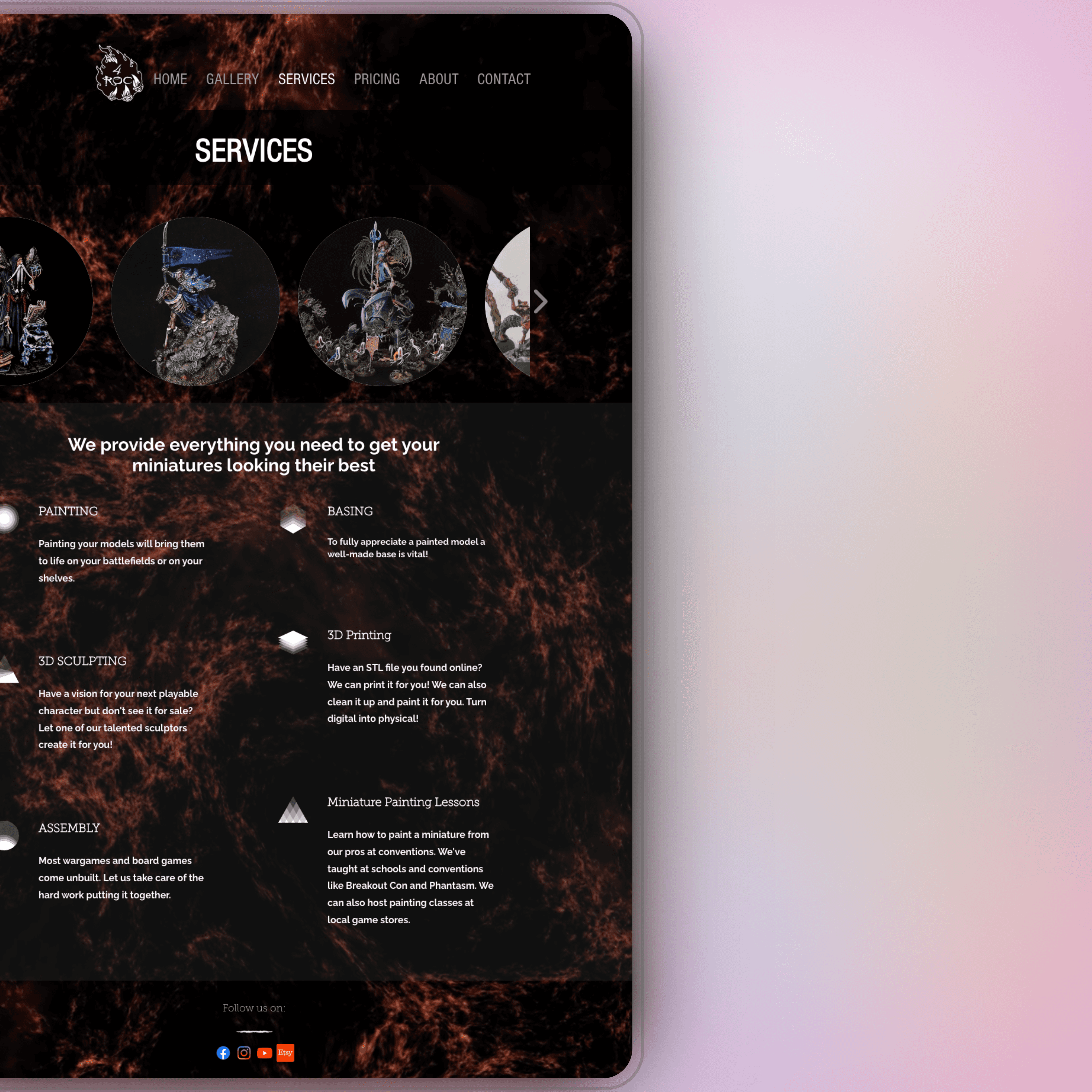
gallery on each service page
I created a gallery on each service page, showcasing the studio's best work so visitors could instantly see the craftsmanship and detail that set them apart.
This was accompanied by a " Get Started" CTA to quickly get to contact form.
Outcome :
enhanced decision making
Users spend less time navigating pricing and services.
quicker conversions
faster decision making means quicker conversions
Challenge 3:
Users struggled to identify key pieces of information like commission process, location, shipping info etc due to lack of visual hierarchy, long walls of text and inconsistent font weights.
Solution:
clear typography system
✅ Structured headings, subheading and readable body text.
✅ Added iconography to break down complex information visually.
✅ Used negative space strategically to improve readability and information absorption.

commission process on main page
I added commission process on main page too for clients to get take a look at the process in a glance.
Introduced a lot of negative space to ensure everything is readable and doesn't overwhelm the user.
similar treatment to showcase studio's journey
I designed a map inspired by the owner’s favourite game, turning their story into an interactive experience that made the website more engaging and immersive.
Outcome :
enhanced readability
The content was much easier to scan.
Improved user retention
Keeping visitors on the site longer.
Moving Forward.
With the redesigned website improving commission inquiries, user engagement, and clarity, the next phase focuses on growth, optimization, and expansion.
short-term goals (0-6 Months)
✅ Expand E-commerce
✅ Optimize User Experience : Track Google Analytics & heat maps to refine navigation and content.
✅ Enhance Mobile Usability : Improve mobile-first design for seamless browsing.
✅ Boost SEO & Content : Strengthen keyword strategy to attract organic traffic.
long-term goals (6+ Months & Beyond)
✅ Interactive 360° Visualizations: Let users explore miniatures from every angle before purchase.
✅ Facebook, tiktok and instagram shop integration.
✅ Shipping and logistics integration.
✅ Video & Blogs : Create YouTube content & grow the gallery for brand growth.
What I Would Have Done Differently?
Working on the website’s user experience was a rewarding adventure, however there are a few things I realize I could do differently that I feel could have made the process easier.

A/B testing form layouts before launch
This would have helped determine the most user-friendly format based on real user behavior.
Stronger mobile-first approach from the start
While mobile usability improved, prioritizing mobile UX testing earlier could have optimized interactions sooner.
Choosing the right platform
Key Takeaways and Learnings
As I tackled the project, I learnt a lot along the way that I feel made me a better designer.
UX directly impacts business operations
The redesign streamlined client inquiries, reduced delays, and improved operational efficiency, showing that UX is not just about aesthetics but also about functionality.
Stakeholder buy-in requires data & storytelling
Presenting research insights, competitor analysis, and usability testing results helped convince the owner of necessary changes that initially faced resistance.
Learning to do more with constraints is essential
UX is a messy process
